Monday, April 25, 2011

ASSIGNMENT 1; PHOTO JOURNAL PART 2

 1. What are the main differences and similarities?

Press photography (or Photojournalism) is a type of photography made to deliver current events to the world. The role that the photographer plays to share press photography is mainly to report about different events and display facts, with never altering the true being of the situation. 

Henri Cartier-Bresson stated "…If you made yourself obvious, even just by getting your light-meter out, the only thing to do is to forget about photography for the moment and accommodatingly allow the children who come rushing at you to cling to your knees like burrs." What he is trying to say is that if in the situation of a photojournalist, you become invisible to let the photograph speak for itself, that is when you will have the best chance to capture the TRUE meaning of the photograph. Even taking a moment to check what the light meter says, the photographer makes him/herself visible, ruining the moment to capture something that isn't the truth.


Help to Father. Sierra Lione.
Unsuccessful Jump
 I chose to bring out two types of Press Photography photos. One of a sad but inspiring photograph of a son who helps his father button up his shirt because he has no hands. and one of a woman failing to clear a jump off of a diving board during a diving competition. We see in the news different types of news, whether it be the cause of war, or just pure entertainment of a simple miscalculation.

 Art photography is another for of photography used to showcase creative talents of the artist. As McDarrah stated "photography that is done as a fine art -- that is, done to express the artist's perceptions and emotions and to share them with others." Many of this kind of photography is altered or staged to get the message of what the artist wants across.

In the society today men are made to act as "real men", that being vulnerable is not attractive and should never be done. 
"Crying Men" 2004 Hayden Christensen


Add caption
 

These are photographs from a collective series called "Crying Men" by Sam Taylor-Wood. It isn't a picture captured at a moment of vulnerability, these pictures were taken to capture the "...vulnerable masculinity..." that Taylor-Wood wanted to convey.

 2. Is it ethical and acceptable to alter art photographs? Why? Why not?

The photographs of the Crying Man series I posted, even though they do not look altered, they were. The actors chosen for the shoot knew how to cry on demand, it was just a matter of capturing the picture at the right moment. I feel that is it very much so acceptable, it is their sense of truth. There shouldn't be a line as to whether or not an artists point of view is wrong or right.

3. Is it ethical and acceptable to alter press photographs? Why? Why not?

In the case of Press Photography it isn't ethical nor acceptable to alter the photo. This type of photography has its own code of ethics and rules that the photographer MUST follow, to be able to convey the truth. The purpose of these photos are to show reality, if they are altered they are no longer the truth but are now an interpretation of the truth.

BIBLIOGRAPHY

Blog about ... - Blog about ... Web. 25 Apr. 2011. <http://greatblogabout.org/?p=31>.

 
"Gender Across Borders » Sexism in the Media." Gender Across Borders. Web. 25 Apr. 2011. <http://www.genderacrossborders.com/tag/sexism-in-the-media/>.
My Blackboard. Web. 24 Apr. 2011. <https://gbc.blackboard.com/webct/urw/lc5122011.tp0/cobaltMainFrame.dowebct>.
"Photojournalism." Wikipedia, the Free Encyclopedia. Web. 25 Apr. 2011. <http://en.wikipedia.org/wiki/Press_photography>.
"Sam Taylor-Wood." Ifinks. Web. 25 Apr. 2011. <http://samkirkfinks.blogspot.com/2010/10/sam-taylor-wood.html>.

VIRTUAL ESSAY


When I was in high school, I had taken an elective of Journalism. At the time, the war in Afghanistan was really big. My teacher had given us an assignment of researching the cause and effect of the war to the people who lived there, and the effect it had on Canada as a nation. I wanted to include photos of war to give more of an impact on my presentation. The way I went about getting photos was to just Google them, that is when I stumbled across the photographic work of James Nachtwey.

James Nachtwey is an American man born and raised in Massachusetts. Photos that came from the Vietnam war and the American Civil Rights Movement had a great effect on him, which ultimately led him to become a photographer. He has covered many wars from Afghanistan, Bosnia, Vietnam to Rwanda. 

A few weeks ago I was looking through some of my old magazines of Vanity Fair and saw a picture captured by Eddie Adams. I thought that the picture may have been taken by Nachtwey and when I checked to see who  it was from it said Eddie Adams. I knew then that these two were the perfect match for this project.

Starvation, Haiti, 1976
Starvation, Haiti 1976; Photograph by Adams

Rwanda, 1994, Survivor of Hutu Death Camp; Photograph by Nachtwey


Both of the pictures show the effect of a war, although they may not be the same war the effect is the same, pain and suffering. The photographs both focus on the boys in it, the background is doing what it should to help bring out the subject even more. Both of the pictures are in black and white, which about a week ago I learned helped bring out a certain emotion to help make the photograph have an impact, and in this case is sadness.

Most of Nachtwey and Adams' photographs are in black and white. I feel that it is only right to give that feeling of sadness because after all their photographs are about different types of war. 

World Trade Center construction, 1973
World Trade Center Construction, 1973; Photgraph by Adams


Ruins of World Trade Center; Photograph by Nachtwey

After doing research on Eddie Adams, I came across this  picture of the World Trade Center being built. It immediately reminded me of Nachtwey's photograph on the same subject but in ruins.

Israeli Soldier, 1970
Israeli Soldier, 1970; Photograph by Adams


Mourning a brother killed by a Taliban rocket; Photograph by Nachtwey


The certain thing that I love about both of these photographers is that they do not tell whomever it is they are taking a picture of how to pose or act in the picture. It is all in the moment, a picture they see in their minds to be great that they need to take a photograph of it. In these photographs, both Adams and Nachtwey have captured a moment of misery. I feel that the Israeli soldier is taking a moment of his time to sit and think about who he is protecting and who he is fighting. From his posture it makes me think that he feels miserable. While the photograph by Nachtwey shows a sisters misery of losing a brother. What I love about these pictures is that even though both of the subjects faces are covered I can feel the emotion that they are feeling through the way the photograph was taken.

Chinese Soldiers, Peking, 1975
Chinese Soldiers, Pecking; Photograph by Adams


Mujahedin praying while on an operation against the
Soviet army; Photograph by Nachtwey


The two photos above are similar in the way that they are about a group of soldiers coming together to fight for their cause. I though it was brilliant that both Adams and Nachtwey took a photograph like this and to add they both took it in a color instead of black and white.

Haitian Women waiting for food, 1976
Haitian women waiting for food, 1976; Photograph by Adams

Jubilation at announcement of Suharto's resignation; Photograph by Nachtwey


When I saw the picture of the Haitian women I just wanted them to be happy, the looks on their faces made me sad and angry. The emotions caused by that picture made me want to help find a solution to their problems so that they could celebrate. This emotion brought me back to the photograph by Nachtwey of the joy and celebration that ensued after Suharto's resignation. Even though the pictures similarities is only limited to a group of men and women to the black and white effect, the emotions that a photograph brings is another aspect that i truly appreciate. 
 

BIBLIOGRAPHY

 "Exhibition - Robert Adams." Matthew Marks Gallery. Web. 14 Apr. 2011. <http://www.matthewmarks.com/exhibitions/2003-11-08_robert-adams/>.

"Eddie Adams Prints | Eddie Adams Photographs | Eddie Adams Photos." Monroe Gallery | Black    and White Photography. Web. 22 Apr. 2011. <http://www.monroegallery.com/photographers/display/id/66>.

Sunday, April 24, 2011

PHOTO MANIPULATION

Original Picture
 
Edited by Pixlr
A weekend getaway to Sauble Beach is perfectly captured in this photograph. The intention of the first picture was to capture a fun "Baywatch" inspired picture. In the original picture my eyes tend to go the boy watching the ocean. Although as said above the intention of the picture was to capture my friends and I splashing about in water. To capture just that I decided to tint the picture an ocean blue, this helped get that feeling of summer, warmth and fun when looking at the photograph. In the edited picture, my friends and I are a bit more noticeable instead of blending in to the water. The tint of ocean blue has also made the waves of the ocean more present. I decided to focus the picture to the group of girls, which in turn made the corners of the picture fade black. I think that this makes the picture look as if it was a postcard for summer, or just the perfect picture to put in a summer or beach themed scrapbook. 


Original Picture
Edited by Pixlr

When my family from Winnipeg decided to come for a visit, my parents took them around to Niagara Falls, downtown Toronto and pretty much just around where there is something "important" to see. When I was looking through the pictures that they took on their trips, I found this one. I do not know where this was taken, but it was just a statue sitting on a bench. It made me laugh because it shows how funny my dad actually is. The statue does not show any emotion at all, but I feel that my dad sitting down beside it and expressing the emotion of telling a story, the statue became "alive" as if he was invested in actually listening to what my dad had to say. What I had decided to do to this picture was to make it black and white. I felt that by doing so it would blend or rather connect my dad to the statue more. So I made it Black and white and highlighted the picture to bring my dad, the statue and the bench that they were sitting on more.

Original Picture
Edited by Pixlr

 The perfect timing with the combination of spontaneity was combined in this picture. My best friend and I had always wanted a picture of both of us in the air jumping. I had lost count on how many occasions, how many times we would try to get a picture like this. I felt that the picture was ALMOST perfect, I did not want to change it drastically because all it needed was a boost of color. Therefore that is exactly what I did. I boosted the color which made us stand out more, and highlighted us. I also decided to blur the top and bottom part of the picture, I felt that it didn't do justice, or add to the picture. This way it really is just my best friend and I being the star of this beautiful picture. 

Bibliography

http://pixlr.com/express/ 


Thursday, April 21, 2011

WEEK 11; KERTESZ AND CARTIER-BRESSON VERSUS SMITH AND SALGADO: COMMENT

"Also, some people might be shy around cameras and not give 100% of themselves and their emotions if they know they're in a photograph, whereas if it's a candid photograph and they didn't know they were in it, their true emotions will show. "

This is such a TRUE statement. The "real" photographs are best captured when it is candid, often people try so hard to be "themselves" in front of a camera that they turn into a completely different person.

The photographers this week both have a different style of showing us the truth. Kertesz and Cartier-Bresson show the truth by letting the moment be, capturing that moment to show the world. As to Smith and Salgado they bring the truth out, of those who may not want to. Personally i prefer the photographs of Smith and Salgado, they want people to interact with them to really get that emotion.

WEEK 9; SHOOTING THE TRUTH: COMMENTS

Straight to the point, and very blunt. I loved it! ESPECIALLY for this week being (as i said before) straight to the point and very blunt only adds to the presentation. As I was reading I came across a comment of why the photographer did not help the little girl in the picture. His ethics for photography were correct but as for the human code of ethics it may not have. I feel differently about this situation, only because IF he had never took this picture before helping the little girl*, what truth would the photo have. This picture serves as a message, that although in North America we may have a hard life, somewhere else in the world they have a HARDER life. I feel that he did do the right thing, because now we have this photo that serves as a reminder to help people in need. 

                                       *

DOCUMENTING THE GREAT DEPRESSION: COMMENTS

Great presentation week 6! 

The first thing that really caught my eyes were the photos that the group provided, it really helped in relaying the message of what the week was about. Reading about it is completely different than ACTUALLY seeing it.  The picture of the "migrant mother" made me think of the saying "A picture is worth a thousand words" seeing it just really made me feel for her and the people that endured this awful time. The answer to the last question says it all, photos are now a sort of guidance to us to do the right thing, and in this case not let the another Great Depression start.

Monday, April 18, 2011

WEEK 13; THE NEW REALITY OR FICTION; CONTEMPORARY PHOTOGRAPHY

Alterations are not allowed in press photography, but they are one of the tools used in contemporary art photography? Why?


Photographs play an important role, there are many rules that differ within the different styles. The ethics of Press Photography is that press photos should never be edited/touched. It should always be kept in its original because alterations often hide the truth that the press photographs are trying to convey. As time goes on editing in photographs are becoming more common, just as ethics are developing. Getting to tell the truth of a story is not a major component in Contemporary Art Photography, making alterations a great tool to utilize. Using this tools has the ability to create an atmosphere for the audience to think about the feelings that are being illustrated in the photograph. An example of how an artist may do this is if they want to bring the feeling of sadness through the picture, a black and white effect will help express this feeling more effectively. 


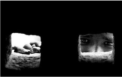
How does this photo make you feel? When I first came across it it just brought me an overwhelming feeling of sadness for the boy. I felt his pain as if he was trapped in a world of war, and without even asking his eyes are telling me that he wants my help. 

Compare photographs of Sommer, Adams and Klett versus  Parkeharrison, Muniz
and Crewdson. What happened to the photography? Is this its future?
 
Sommer: Jack Rabbit
Preview
Adams: No Small Journey
Klett: Looking East... Winds, 1981
Sommer's photography has focus on nature, and its ending course of death. Above is a picture of a rabbit, although it looks as if it is springing off to somewhere else, it is actually decomposing within its surroundings. This is his way of capturing photography, although it is not accepted by many. Adams photographs, although are in black and white, show us journey to a place that brings happiness. Klett's photographs are somewhat similar to Adams; as he captures landscapes and different cultures. His photograph shows a temple, one that looks as if no one has been there for quite some time. Although through his photography he captures the connection of the temple and nature. As a collective group, these three photographers capture the history and nature that is around us. Their work gives us the opportunity to think back into our memories.Parkenharrison, Crewdson, and Muniz demostrate fantasy and abstract by using alterations as a tool on their photographs. They create what the subject is to what the background will be. There is colour in their photographs, which is the main difference between the two styles.

ROBERT AND SHANA PARKEHARRISON - Summer Arm, 2007

Photography is faced with new concepts everyday. The ethics change and develops into new ones. As we leave behind the old techniques we discover new ones. There are trends that develop making it the "NOW", although the future can never really be told.

BIBLIOGRAPHY
 
"Exhibition - Robert Adams." Matthew Marks Gallery. Web. 14 Apr. 2011. <http://www.matthewmarks.com/exhibitions/2003-11-08_robert-adams/>.
"Frederick Sommer - Galleries." Frederick Sommer - Frederick & Frances Sommer Foundation. Web. 14 Apr. 2011. <http://www.fredericksommer.org/index.php?category_id=11>.
My Blackboard. Web. 14 Apr. 2011. <https://gbc.blackboard.com/webct/urw/lc5122011.tp0/cobaltMainFrame.dowebct>.
"Robert and Shana ParkeHarrison." Catherine Edelman Gallery. Web. 14 Apr. 2011. <http://www.edelmangallery.com/parke-counterpoint.htm>.